




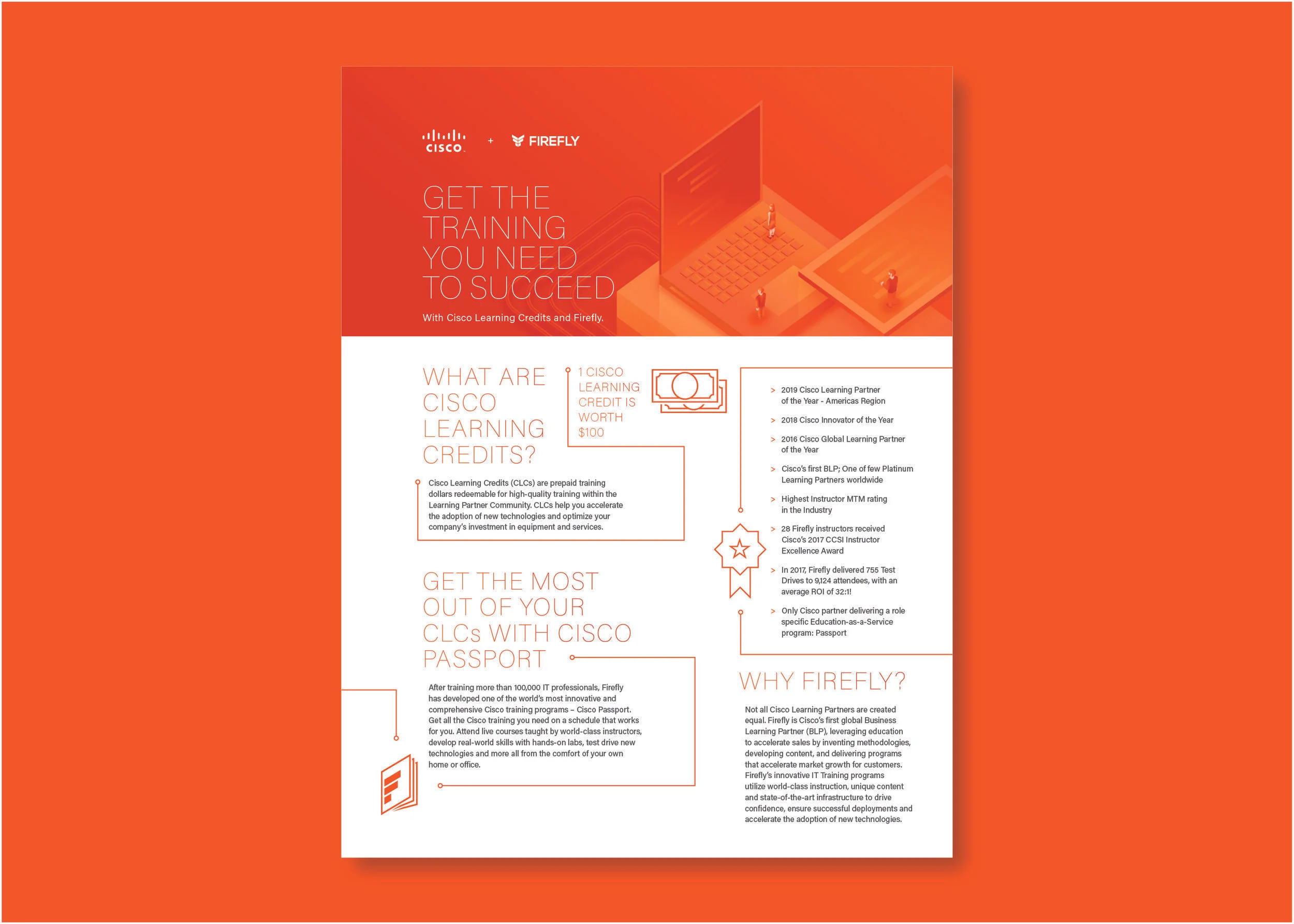


With Firefly, an IT training company, I was the sole designer working directly with the developer, content strategist and CEO. Having such an intimate team meant that everyone was a key factor in the collaboration of print collateral (internal and client facing), email marketing and social media marketing. Once decisions were made at this level, it was up to me to make sure that the direction of these materials all remained within our message.
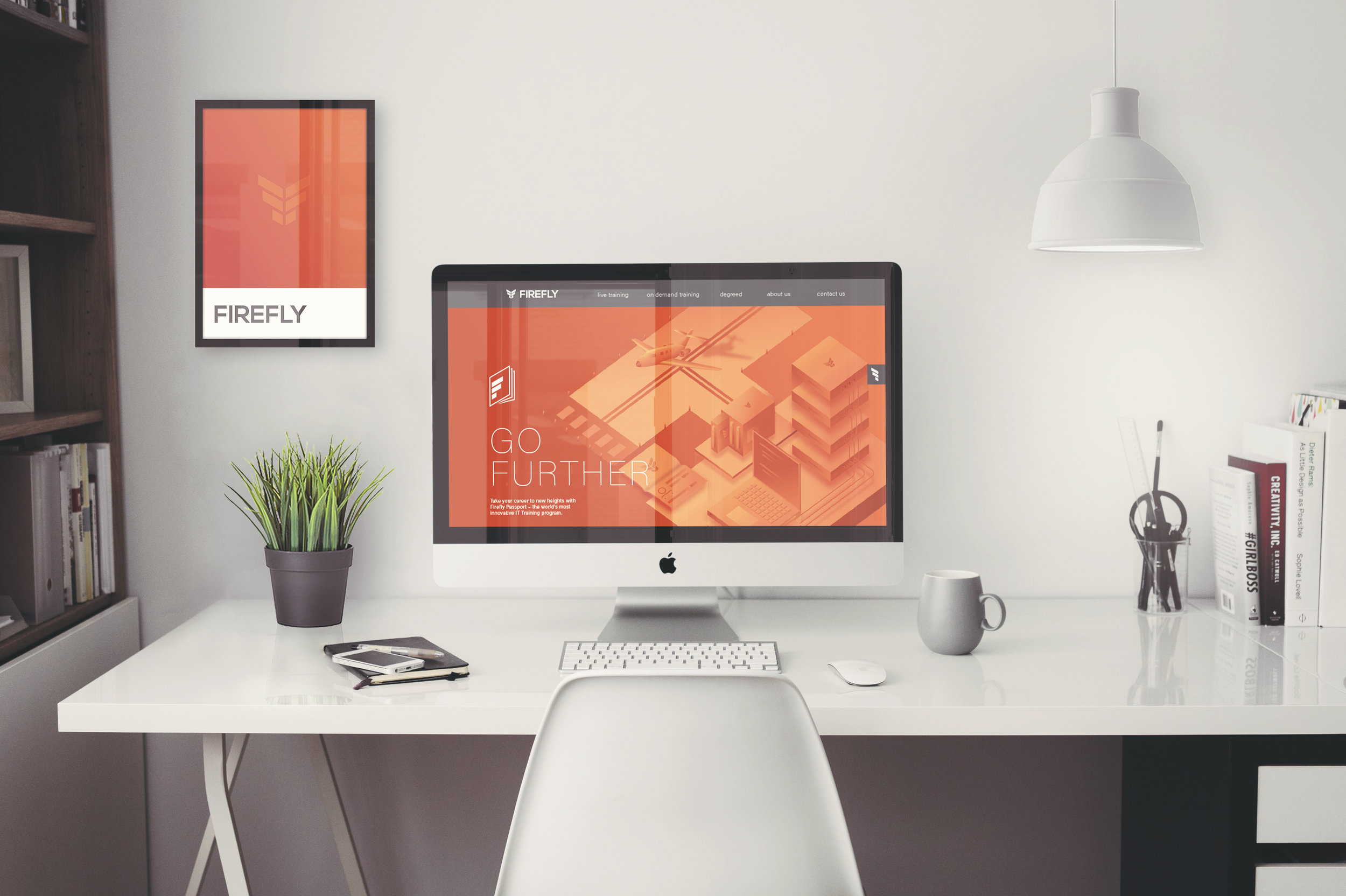
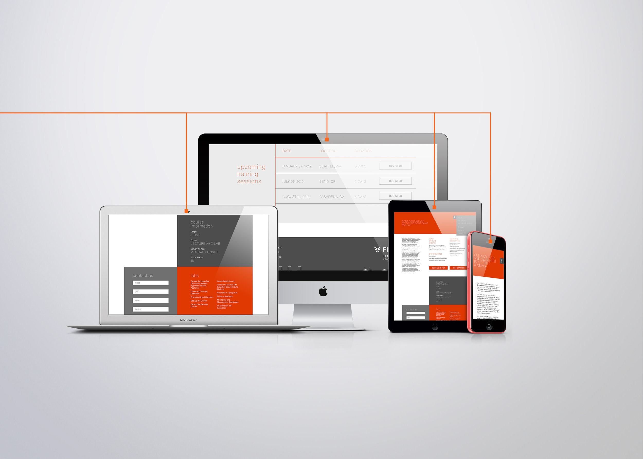
As the sole designer I was responsible for the design and direction of the website which means curating graphics that tied into the new Passports initiative, hence the airplane at a terminal of data servers to bring the IT message home. Along with the graphics, the layout, icons, and the UI/UX of the website were largely on my shoulders. The main focus of this site was to take the information from their existing site (fireflyeducate.com) clean it up and establish passport branding (fireflypassports.com).
